

WILD Hot sauce


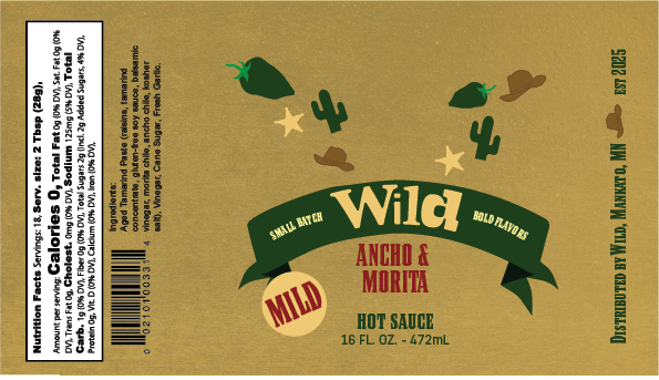
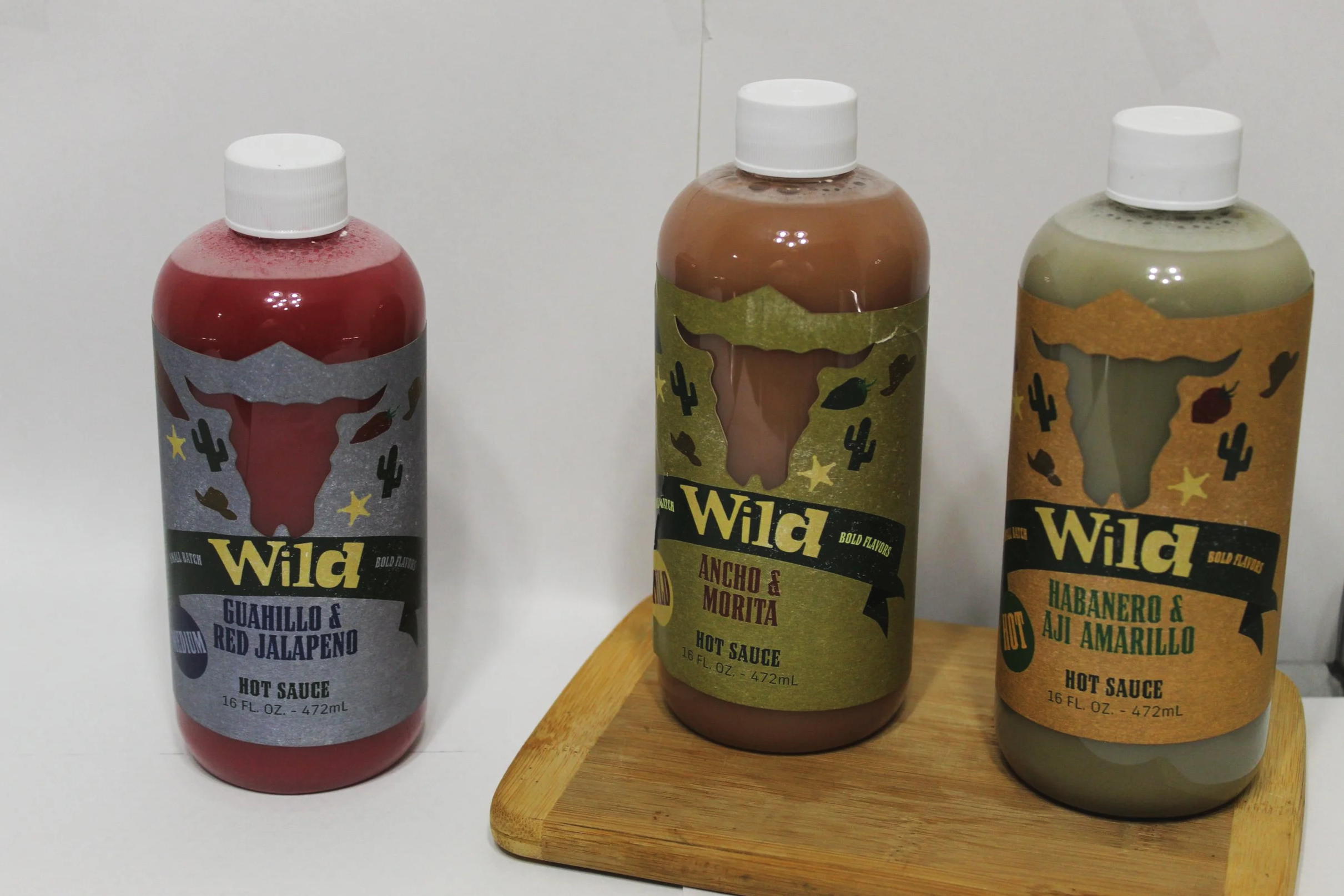
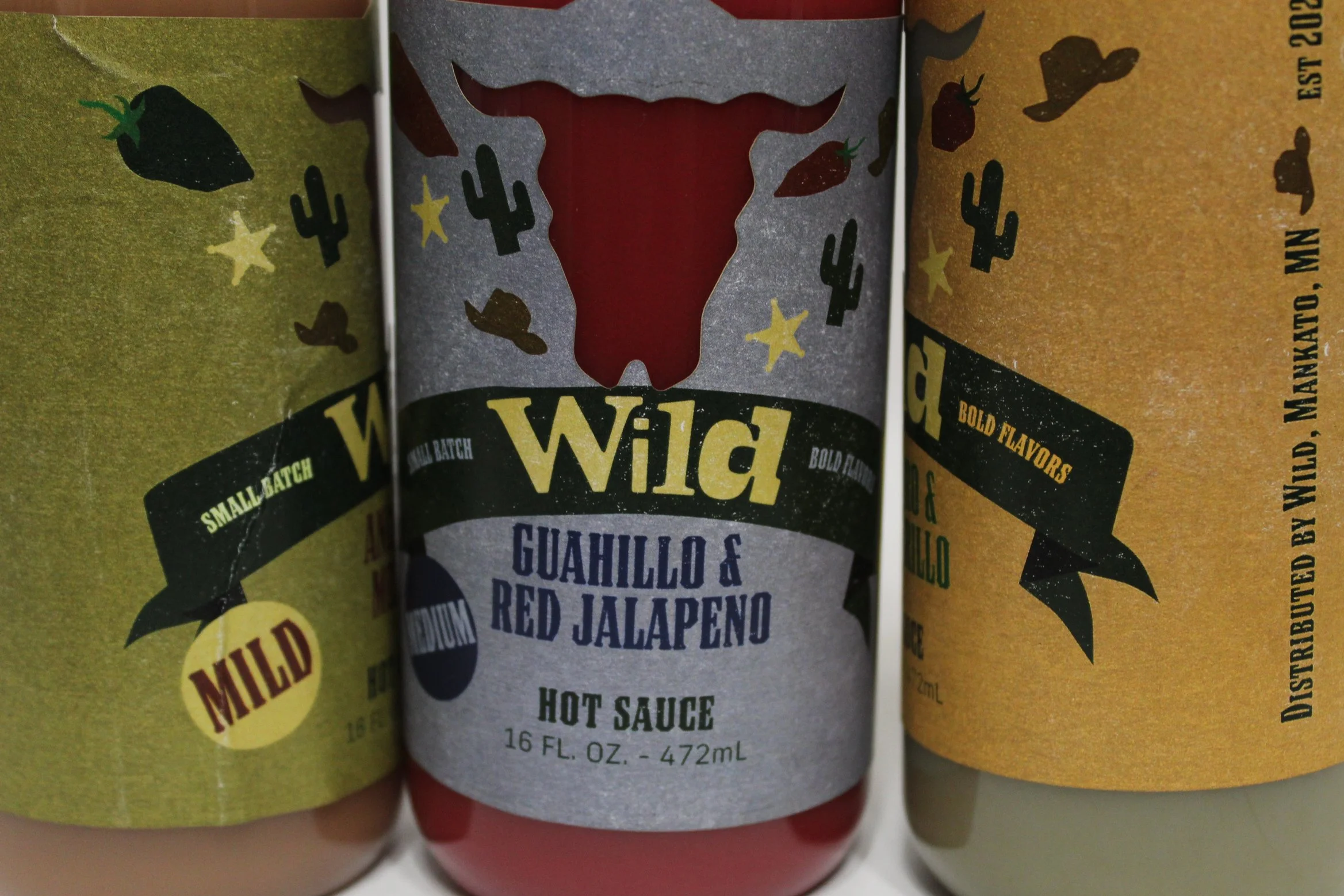
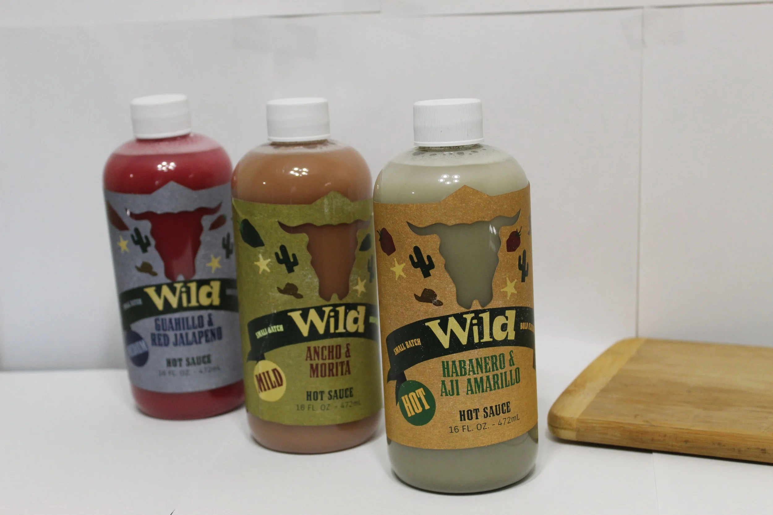
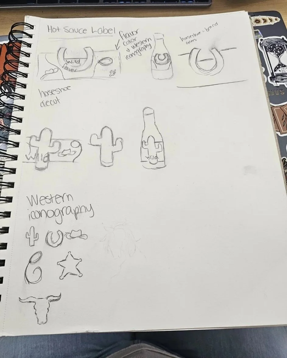
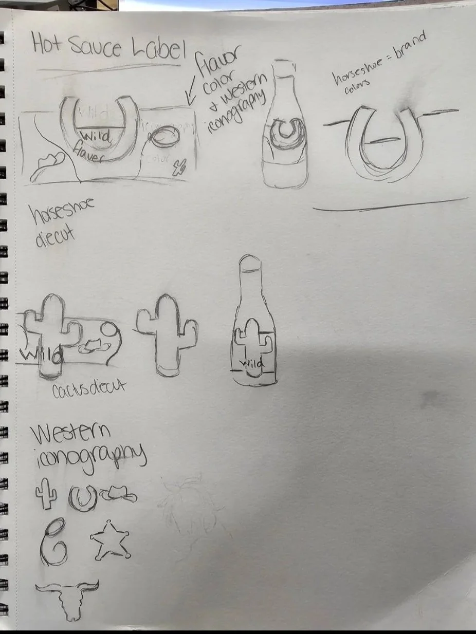
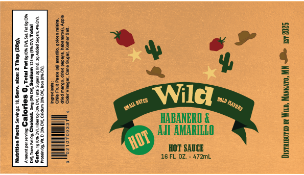
I was tasked with creating three different packaging bottles for a hot sauce company called Wild. I wanted to create something bold with a clichéd Wild West feel. I thought of an old western saloon, which is where you would typically meet the outlaw, hence the bull skull die-cut.
Why?
Since my chosen personality was the outlaw, I wanted to do something bold and a little reminiscent of the Old West. I began thinking of old western films, and where we would meet the outlaw. My brain immediately went to a saloon, and I thought of potential decor inside a saloon. My brain immediately went to a bull skull, so the die-cut is a bull skull!
Year
Fall 2025
Client
Wild Hot Sauce
Process
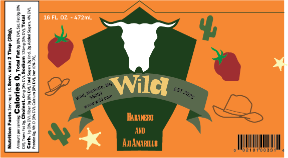
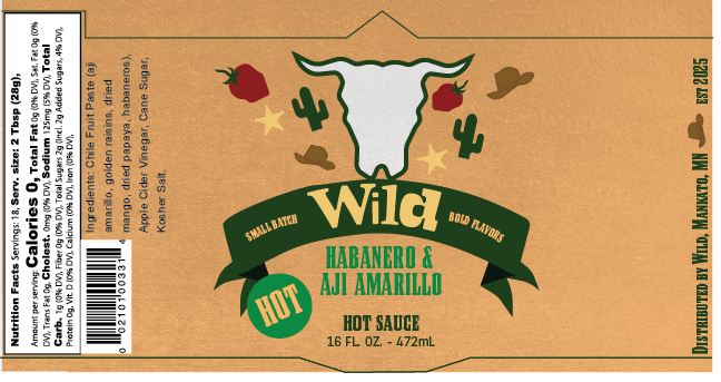

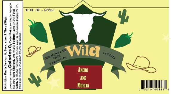
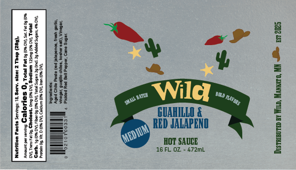
These are the earliest versions of the digitized labels. Upon designing, I realized that I did NOT like the plaque behind the skull. It felt too out of place. And, I didn’t like the lack of texture. It felt too boring for a hot sauce.
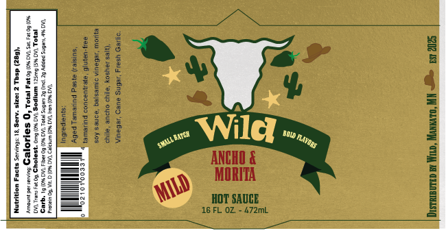
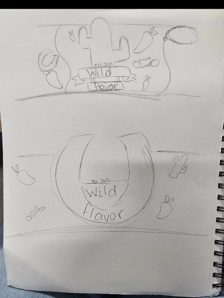
These are my earliest iterations of the WILD Hot Sauce. I knew from the start that I wanted to do something wild west, but I couldn’t quite figure out what.
That’s when I began thinking of the outlaw personality I chose for this, leading me to the bull skull! (It also felt less generic in my opinion).
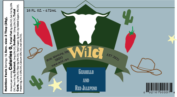
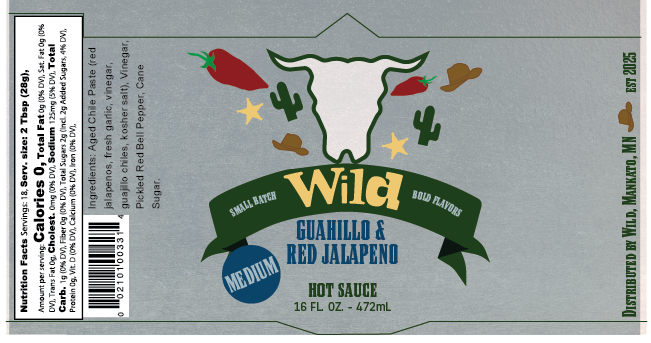
TEXTURE! The texture definitely helped bring out the personality a bit more. I also darkened the colors a bit to make my graphics more noticeable. The thin lines? Those are the die-cuts.

Finally, a version ready for printing and laser cutting. In doing this project, I learned that I really like package branding, and I hope to do a lot more.